Mapping science
Like many geologists, my understanding (or lack of understanding) of complex phenomena is rooted in the ability to visualize the process or system in question. When pondering the fundamental workings of a river system, for example, I don’t see equations…I see patterns. I try and visualize spatial patterns as well as temporal patterns (i.e., the history of the system). Take a look at the papers geologists write…they are chock full of maps, cross sections, diagrams, geophantasmograms, etc. Complex information is best represented visually…at least, when one wants to express a general message succinctly.
One of my very favorite sites on the web is called Visual Complexity. I blogged (briefly) about this site once before, but VC recently posted an interesting visualization on the site that shows a map of science.
How was this done? Here’s a blurb from VC about the project, which is called Eigenfactor:
Eigenfactor.org is a non-commercial academic research project sponsored by the Bergstrom lab in the Department of Biology at the University of Washington. Eigenfactor ranks journals much as Google ranks websites. Scholarly references join journals together in a vast network of citations. Eigenfactor uses the structure of the entire network (instead of purely local citation information) to evaluate the importance of each journal.
A more detailed description of how this is done, high-quality images, and an explanation of what you’re looking at can be found on VC’s site here.
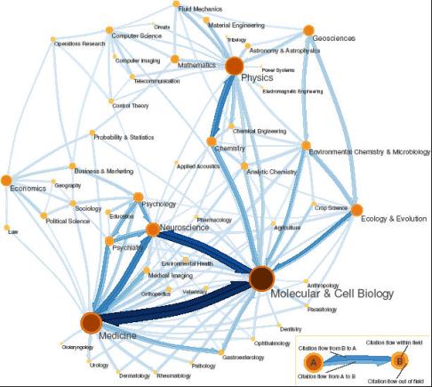
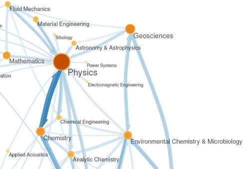
Very cool. The next image (below) is zoomed in on the northeastern outskirts of this ‘map’…where all the hippest geoscience hang-outs are.
The Eigenfactor project website is here. It’s pretty dang cool.
~
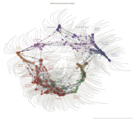
UPDATE: Kate clued me in to a similar project and visualization (below); read about it at SEED here and go then go here to see in more detail. As with the above images, you really have to check out the sites and see them in that full resolution to appreciate.
~~~~~~~~~~~~~~~~~~~~~~~~~~~~~~~~~~~~~~~~~~~~~~~~~~~~~~~~~~

SEED magazine did a similar thing recently:
http://www.seedmagazine.com/news/2007/03/scientific_method_relationship.php
it’s currently hanging on the wall of my lab office.
oooh…that one is pretty cool…thanks