Creating Data Plots with R
First things first, I’m a novice when it comes to coding/programming. So, those of you who are much better at this are free to point and laugh at my lack of skills. I’ve gotten used to revealing my ignorance on a nearly daily basis, which is fine because the more that I do that the more I learn useful stuff.
I’ve recently started playing around with the free statistical/graphical programming language and software R. (Here’s some good intro documentation.) For a sampling of what the graphics look like, check out this image gallery. I use R through the separate RStudio interface, which I like quite a bit. This image is from the RStudio website with my own text annotation explaining what the four panels are for.

For this first foray into R I’m interested in creating a simple line plot with custom annotation for some grain-size data I have. Down the road I’d like to learn more about statistical analyses with R, but for now I just want to make some nice-looking graphics for a paper I’m writing.
I’m not sure how many of you who read this blog use R, but I thought it might be fun and mutually helpful to start sharing some ideas and code. Just about everything I’ve learned so far (which is the tip of the tip of the R iceberg) was found by googling various commands. There are numerous sites, forums, and blogs out there with people helping each other out. It’s amazing. However, even with all those resources it’s still sometimes difficult to find exactly what you need. This is especially true for a beginner (i.e., me) who isn’t familiar with all the commands yet.
The light-gray boxes with green text have bits of code that generated the plot that is shown below the code. Any lines of code that start with a ‘#’ are extra explanation and not information that R will try to read. At this point I’m putting a lot of notes in the code to remind myself what it is these commands do. For this post, I amend the code with very simple changes (additions, subtractions, modifications) and show the corresponding change to the plot.
# load the data file (a .csv file with volume% and particle diameter data in columns 1 and 2, respectively)
smb_bed1a <- read.csv("SMB-bed1a.csv", header=TRUE)
This simply loads the data file (first row of the csv file is a text header). The data is now ready to be analyzed or plotted. (Before loading any data files make sure to set your working directory to wherever the file is located.)
Okay, let’s make a simple line plot.
# line plot of vol% on y-axis and diameter on x-axis
plot(smb_bed1a,type="l",main="SMB Bed 1a")
 There are numerous plot types; this one is type ‘l’, which is just a curved line. The best way to check out the options is to simply try out different ones. The default is to put the first column on the y-axis and second column on the x-axis. This can, of course, be changed. It also automatically put the text from row 1 as the labels for the axes. The only other info I put in the code was to add a title to the plot using the ‘main’ function.
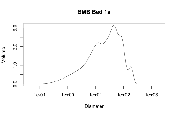
But, grain size is best viewed on a log scale.
# same plot, but changing x-axis to be logarithmic
plot(smb_bed1a,type="l",log="x",main="SMB Bed 1a")
 Sweet, that was easy. Now I want to change the labels for the axes from their default (the first row in the loaded csv file) to something more accurate. This is done with the ‘xlab’ and ‘ylab’ functions. Note that I also use the ‘expression(paste)’ function to get the Greek symbol ‘mu’ to display for micron units. A little thing like that actually took me some time to figure out; I eventually stumbled across this web page.
# adding better axes labels & horiz label text; including adding Greek symbol 'mu'
plot(smb_bed1a,type="l", las=1,log="x",xlab=expression(paste("Particle Diameter (", mu,"m)")), ylab='Volume (%)',main="SMB Bed 1a")
 Also note the ‘las’
 function plot parameter — this makes the y-axis labels perpendicular to the axis (or, in this case, horizontal to the viewer).
Now that I look at this plot, I want to see the data points superimposed on the line. This is done by changing the ‘type’ and the ‘pch’ function plot parameter relates to the kind of symbol displayed.
# changing to line w/ points
plot(smb_bed1a,type="o", las=1, pch=16, log="x",xlab=expression(paste("Particle Diameter (", mu,"m)")), ylab='Volume (%)',main="SMB Bed 1a")
 For my purposes, the default x-axis labeling is not very useful. These are data are from sedimentary deposits, so I want to emphasize the particle diameter divisions based on the Wentworth grain-size scale. This will show which part of the distribution is clay, fine/medium silt, coarse silt, very fine sand, and so on. The first thing is to remove the default tick marks and numbering, which is done by setting ‘xaxt’ to ‘n’ (found here). Then, I add my own axis label by specifying what values on the x-axis I want to display. The ‘c’ function is used ubiquitously in R to assign a vector, which is just an ordered collection of numbers. The ‘cex.axis’ function changes the font size of the label.
# removing default x-axis labels; adding labels to denote sedimentological grain-size divisions
plot(smb_bed1a,type="o", las=1, pch=16, log="x",xaxt='n',xlab=expression(paste("Particle Diameter (", mu,"m)")), ylab='Volume (%)',main="SMB Bed 1a")
axis (1, at=c(4,31,63,125,250,500,1000,2000), cex.axis=0.65)
 After looking at this iteration, I’d like to decrease the size of the data points. I’ll do this using the ‘cex’ function in the main plot command. I’d also like to add some vertical reference lines at the labeled grain-size divisions to help the viewer more easily see how those divisions relate to the distribution. I use the ‘abline’ function for vertical (‘v’) lines and make it look how I want with the color (‘col’), line width (‘lwd’), and line type (‘lty’)
 functions plot parameters.
# decreasing data point size ('cex'); adding vertical lines ('abline v') to show sed grain size divisions
plot(smb_bed1a,type="o", las=1, pch=16, cex=0.65, log="x",xaxt='n',xlab=expression(paste("Particle Diameter (", mu,"m)")), ylab='Volume (%)',main="SMB Bed 1a")
axis (1, at=c(4,31,63,125,250,500,1000,2000), cex.axis=0.65)
abline(v=c(4,31,63,125,250,500), col="gray40", lwd=0.8, lty=5)
 What I’d like to do next I haven’t yet figured out. Maybe this is where some readers could help. I’d like to color-fill under the curve and with different colors for each of the grain-size domains (areas between the custom x-axis tick marks and corresponding dashed lines). Ultimately, I’d like to vertically stack a bunch of these plots so the reader can quickly visualize subtle changes in distribution from one datum to the next. I’ve been wrestling with the ‘polygon’ function quite a bit but haven’t figured it out yet. Sure, I could take what I have here into Illustrator and add the embellishments by hand, but I have >50 of these plots so putting the effort in now to create code I can apply over and over again is worth it.
Now, because this was essentially the first time doing this I’m sure that what I’ve cobbled together here is not the most efficient code. That’s the beauty of R (and any programming for that matter), there are numerous ways to get to the desired result. I’m guessing that there are some functions I don’t know about that could clean this up and make it even simpler.

Dr. Romans,
Thanks, this is a nice post and will prove useful to someone getting started with R.
I think you refer at one point to “las” as a function. It is actually a parameter to the function plot. Nitpicky, but this terminology split will help you in the long run when you’re communicating with coding type people.
I don’t know R, but I’ve worked with a couple people who use it a lot. I googled your problem with the coloration of areas. If I understand it correctly, this thread addresses it:
https://stat.ethz.ch/pipermail/r-help/2009-March/191178.html
It looks like you need to draw the area under the curve as a polygon and then color it in. I haven’t actually done this myself so no guarantees!
Greg Wilson, a Canadian, runs a website and training program called Software Carpentry (a takeoff on software architecture). The general idea is to give grad students and doctoral types the tools they need to use code effectively to make their graduate and research experiences better and easier. If you’re going to be doing a lot of this stuff, it might be worth a look from you or your students:
http://software-carpentry.org/
Thank you for taking these ideas into consideration.
Carl Trachte
Carl … yes, please correct me on misuse of terminology like ‘function’, ‘parameter’, etc. I do want to make sure I communicate accurately. And thanks for the links, I’ll check those out very soon.
Really nice posting; are you sure you are an R noob? ;-)
Couple of points;
1) although R will work quite happily with a matrix or data frame (as you have here) passed to
plot(), it is better all round if you specify what should be on the x and y axes, e.g.Here I used the formula interface and told R were to find the variables via the
dataargument. This is equivalent:(and I use
with()so I don’t have to typesmb_bed1a$Volumeandsmb_bed1a$Diameterall the time.)2)
type = "l"isn’t a curved line, it is a straight line joining the dots; it only looks curved here because you have many data in regions of curvature. Your plot looks nice also, because you have the data in increasing order of Diameter. If the data are not ordered then the lines will go back and forth across the plot, so you will need to sort them.3) It is slightly easier to generate expressions for plot labels without using
paste(). Your x-axis label could have been done as:4) When you draw the vertical lines, it is nice to have then behind the data line/points. The default
plot()method has apanel.firstargument that allows for this sort of thing to be done. To use it you have to change the plot call a little, but something like this will work:with(smb_bed1a, plot(y = Volume, x = Diameter, type="l", main="SMB Bed 1a"), xlab = expression(Particle ~ Diameter ~ (mu * m)), panel.first = abline(v=c(4,31,63,125,250,500), col="gray40", lwd=0.8, lty=5)))5)
lty,pchetc are called plot parameters not functions and most are described in?par. The greek letters bit is part of a thing called plotmath, you can read more about it in?plotmath, including the operators I used when writing the x axis label above.6) Whilst I won’t give you the whole answer to drawing the area under the curve per grain size, take a look at
?polygonand you’ll need to interpolate the data so you can get the Volume at the end points of the grain size window you are drawing, and values for the “line” across the interval (so you have a smooth polygon under the curve). For the interpolation see?approxfor linear interpolation or?splinefor spline interpolation. Judging by your data linear interpolation should be OK. If you can’t get this to work, feel free to ping me on twitter or drop me an email.I never knew about panel.first. I feel deeply ashamed. It just never occured to me to look for such a thing. :-(
Thanks for mentioning it!
@ucfagls
As I replied to Carl, don’t hesitate to pick nits with my usage of terminology. It’s all part of getting better at this.
I’m glad you included some different ways to get the same result, that will help me a lot going forward. I’ll keep plugging away with polygon, I’m just happy to hear that at least I’m on the right path. Thanks much.
Have you tried Ternanies with it? I looked into it briefly ages ago, but could never get ovre the activation barrier of getting anything done.
Ternary diagrams used to be a PITA, but there are packages for these now: http://gallery.r-enthusiasts.com/search.php?q=ternary&engine=RGG
Lab Lemming, I have just published an R package on CRAN for plotting ternary diagrams, it is based off ggplot2. Website is http://www.ggtern.com.
@Lab Lemming … no I haven’t tried that yet, you’re looking at the extent of my experimentation. I use an Excel macro for ternary plots that works just fine.
The example in Carl’s link basically does what you need. But there’s a closing paren missing in the polygon function call before “, col=”.
Also, the example shows the power of logical index vectors (stored in the variable “select”) to extracft slices of your data.
When you have finished the code for colouring one polygon, you can make a function of it for later re-use, e.g.
fill.under.curve <- function(curve.x, curve.y, from, to, …) {
# prepare slice etc.
polygon(x = c(from, curve.x[select], to), y = (0, curve.y[select], 0), …)
}
Function definitions differ from languages like C (“int foo(int a, int b) {…}”). A function is first generated (by “function”) and then assigned to a variable (or, more exact, to a symbol). This seems a bit longwinded, but you'll see later on why it's useful to keep making functions separate from giving them names.
Note the three dots in the argument list: any additional arguments are passed along when the dots are used again. Typically you'll use this for plot arguments like colour:
fill.under.curve(smb_bed1a$Diameter, smb_bed1a$Volume, 4, 31, col="blue")
As you can recognise, there are different styles for calling functions and passing data. In her/his comment, ucfagls used the formula interface (“x ~ y”), I often prefer the $ notation to get columns from dataframes. (However, my function definition above could be more elegant than using “curve.x” and “curve.y”, but I wanted to keep it a bit more simple.)
With your fill.under.curve function, mass production is just a step away. First, store your grain-size limits in a variable (which you can also use for the axis ticks, labels, etc.):
wentworth <- c(4,31,63,125,250,500,1000,2000)
Now, you'll want call the function with all wentworth values assigned to “from” and “to” in turn (functions that do this have names with “apply” or “map”). Brace yourself: ;-)
mapply(function(from, to, col){ fill.under.curve(smb_bed1a$Diameter, smb_bed1a$Volume, from, to, col=col)},
head(limits, -1), tail(limits, -1), c("blue", "red"))
Explanation: mapply expects a function (called “FUN” in the documentation; I'll get to the whole function(…){…} part later) of several (here: 3) arguments as its first argument. mapply's remaining arguments are as many vectors as FUN has arguments; here you need vectors for “from”, “to” and “col”. The head and tail calls are just for getting everything of “wentworth” except the last or first element. Mapply will now call FUN with all the first elements of the vectors, then with all the second elements, and so on:
FUN(4, 31, "blue")
FUN(31, 63, "red")
FUN(63, 125, "blue")
and so on
The remaining piece of magic is to provide the function FUN. Fill.under.curve needs several arguments, of which some must stay the same for the whole procedure (curve.x, curve.y) and some must change (from, to, col). Mapply can only supply the changing arguments, not the constant ones. Therefore, you define a (anonymous) function on the fly, which wraps fill.under.curve in a call with only the arguments that have to change. This is the first part in the mapply() call above; the function “function” returns
function(from, to, col){
fill.under.curve(smb_bed1a$Diameter, smb_bed1a$Volume,
from, to, col=col)
}
This function call returns a function which takes three arguments (from, to, col) and calls fill.under.curve with smb_bed1a$Diameter and smb_bed1a$Volume already fixed and from, to, col taken from the call.
If you like these principle of functions working on functions, you might want to proceed with reading the book Gödel, Escher, Bach…
But with time, you will write useful, basic functions (“tools”) which you then can combine and apply to do complex calculations, statistics or diagrams.
Sorry about the poor formatting, but I don’t know what amount of HTML in comments your blog accepts.
Note that your
fill.under.curve()assumes you have a data point at the boundary of the polygon, which doesn’t look the case for all of Brian’s data nor will it be generally the case. That was why I mentioned interpolation so you could get a best guess of the “curve” (exact in the case of linear interpolation as that is how R draws withlines()) at the boundaries even if you don’t have data at those points.As you already talked about the need for interpolation and mentioned
approx, I left that out. Even then, my comment suffered massive bloat. (I started with checking/fixing the example linked to by Carl and got carried away a little bit.)But I should have pointed out that part of the problem anyway. Thanks for reminding me!
fj and ucfagls … thanks for the comments here, I’m hoping to try out these ideas in the next few days. I’ll post a ‘Part 2’ to share how it went.
Hi Brian
I am even more novice than you with R and so this kind of post really helps.
I just recently got myself a copy of Visualize This from Flowingdata – which I recommend.
Happy coding.
FYI, there is a plugin for R called GCDKit, short for Geo Chemical Data Kit. It is a frontend for the language, and contains ready made tools for statistical analysis, graphing and classifications, just to name a few.
Hi Brian (and those who’ve left comments),
I’m so pleased I found this post, only 18 months late! Brian, you mention you have (had?) 50+ samples to plot – I wonder if you put Loops to use to effectively plot all the PSDs on the same graph? I am a self-taught R user and very much a beginner and I’m struggling to make Loop functions work. I am seeking to plot a series of particle size distributions as a sequence of lines on one graph; I feel like there must be a quick alternative, perhaps using a Loop, to typing the lines() function repeatedly to show all the PSDs on the same graph… Any thoughts would be most gratefully received!
I see you don’t monetize clasticdetritus.com, don’t waste your traffic, you can earn extra
cash every month with new monetization method. This is the best adsense alternative for any type of website (they approve all sites), for more details simply search in gooogle: murgrabia’s tools