GoogleEarth visualization of oil consumption
January 3, 2008
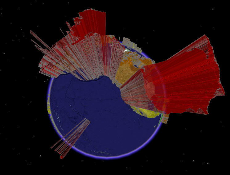
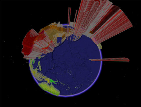
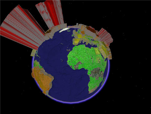
A friend clued me in to this cool GoogleEarth visualization that shows oil consumption by country. The screenshots below show total consumption (height is proportional to barrels of oil per day).
You can get the file at the GoogleEarth Blog here.
~~~~~~~~~~~~~~~~~~~~~~~~~~~~~~~~~~~~~~~~~~~~~~~~~~~~~~~~~~~~~~~~
4 Comments
leave one →

Is there a per-capita version? ’cause with this we could make Europe look bad simply by combining all the member countries into one EU block.
Never mind, I should have clicked the link BEFORE asking…
no worries … I was gonna put images of per capita up too, but basically got lazy… maybe i’ll update it later
Suvrat, thanks for the link…those are good maps to have handy.